Wednesday, January 31, 2007

Stop Me If You've Heard This One Before...

Ah...one of my favorite tales of angst. A few years ago, I was charged with the task of coming up with a sort of mascot for a website to get teens to quit smoking, TeenQuit. A noble cause, for sure. I whipped up a little blue jellybean type character, figuring he was pretty innocuous. Slam dunk. I'm done, right? I was more than slightly shocked to be informed that he's "too white." And he should be more ethnic.

So I complied. It was a knee-jerk response. Of course, by the time I had done this, it was a moot point, because the mascot should be a dog.

I drew up scads of dogs. When one was decided on, I did bunches of color variations of that. I even went so far as to design a poster that was to be a part of the project. And I thought the kids would get a kick out of it, too. I was pretty happy with it. But the powers that be had changed their minds again. The mascot should be....a teen!

And just what does that teen look like? Blonde hair, blue eyes...kinda white looking. Exactly what they didn't want in the first place. There's also an African-American female character. So it sort of balances out. I was pretty aggravated and felt like I should do something subversive. I was reading "Lexicon Devil" at the time, the biography of Darby Crash and the Germs. So I put a Germs shirt on the kid. It made me feel a bit better, even if no one who ever sees this knows anything about the Germs.

Tuesday, January 30, 2007

Bad Ideas, Bad Drawings


This is some stuff I should've blocked out of my memory. Stuff for an interactive CD-ROM game to teach kids about the ill effects of cocaine. No game architecture document. No consistent art direction. Rules of game play constantly changed. A real pill of a project. It's all in green because "you're looking through night-vision goggles." Riiiight. Back in the days when I was actually working on this, I described it to a friend. His response was, "Wow. That sounds like the worst video game EVER." Yep.

Sunday, January 28, 2007

Illustration Friday: Red

I did this a few years ago for a friend. I don't remember why...it was some response to an e-mail or link that he sent. Whatever. It's red and I'm lazy.

You Are Here


Inspired by the YOU ARE HERE signs at a museum, I made some signs for my house. Here are a few of them. I neglected to do ones for the basement and attic, so if you happen to get lost in either of those places, man, you're screwed.

Thursday, January 25, 2007

TRANSPLANT


I started working up some new stuff tonight. It fits a little better into the whole TRANSPLANT theme. And is basically a reworking of one of my abandoned ideas from a few years ago...

Wednesday, January 24, 2007

Headcases


More stuff I'm working on. They could possibly end up in my upcoming show. Or not. I'm not feeling too good about my recent stuff. It's a problem of too many ideas and too little time and patience. I need an army of robot monkeys to do my work. I've thought about cloning myself, but all my clones would be too lazy to do the work. Or come up with too many of their own ideas.

I've also started posting some of my quick and crappy comix on my alter ego's blog.

Monday, January 15, 2007

Stephen Kroninger's Blog


Stephen Kroninger is one of the reasons I miss NYC. I met him at his studio during an Illustrator's Weekend in 1998. We've been pals ever since. When I was working in NYC, I'd have lunch with him almost every Friday. His collection of art, comics, music, movies and arcane knowledge is astounding. And now he has a blog. Lick My Decals Off Baby.

Friday, January 12, 2007

TRANSPLANT CAROUSEL

Promotion for TRANSPLANT, an art show at Asterix Gallery in Cleveland, March 9-April 7. The artist are Saxton Moore, Jorge Lacera, Carlos Villagra and Dave Savage. The carousel is in the window of Big Fun.

Mind-Blowing Friday Night

I just picked up some Flying Dog which Ralph Steadman did the art for the labels. I got home and 10 Films By Oskar Fischinger was waiting for me. Truly amazing stuff. That inspired me to throw in Religiones Sauvages by Le Dernier Cri. And that reminded me a bit of Coffin Souza's Freak Circus which I got from Shocking Videos. And that makes me feel compelled to mention TV Carnage and Alamo Drafthouse. It all makes me want to install a Nam June Paik type video wall in my house...so much great sensory overload.

Wednesday, January 10, 2007

Berlin Sculpture


Last week at work, I gave a presentation about my trip to Berlin. One of my coworkers wanted another look at the sculptures I photographed. Here they are.

Ninja for Breakfast

Maybe if I eat enough ninjas for breakfast, I'll get enough gumption to catch up on my Illustration Friday posts.

Friday, January 05, 2007

Dumpster Diving, Demo Reels and Resumes

On my most recent dumpster diving score, I retrieved about half dozen CDs and DVDs of people's work. Look like Human Resources was doing some house cleaning and dumped a bunch of resumes and work samples. I didn't have any interest in reading resumes, but I figured I could have some fun looking at some work and at least use the jewel boxes from the discs.

I was really pretty surprised at the lack of consideration that went into a lot of the discs. The actual work on the discs ranged from mediocre to fairly professional. The bulk of it sort of made me ask, "what were they thinking?" So I feel compelled to put together some tips and reminders for sending stuff out.

1. Put your name and contact info ON THE DISC. Printed up on a nice label is best, but at the very least, use a marker. I'm sure some of these people thought they sent a cover letter or made a nice little booklet for the jewel case, not considering that the disc could somehow become separated from that info.

2. Once again, put your name and contact info somewhere IN THE CONTENT of the disc. This comes in handy if someone is reviewing your material, they don't have to hit the eject button to get the correct spelling of your last name or contact info. One disc I found was sent out by a school of the recent batch of graduates. A cool idea, but it failed to contain any contact besides the school contact info. I can't imagine too many potential employers calling up the school, "Hi, I've got this CD of student work. I really like joshua_04.jpg. and would like to call whoever did that in for an interview."

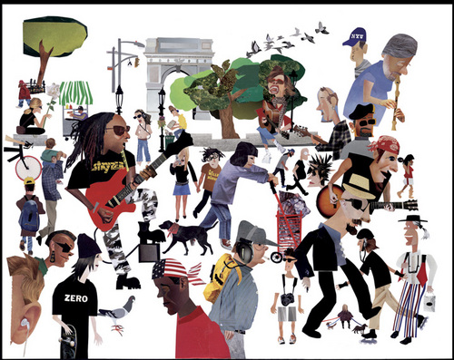
3. Make sure your content looks good. You may have done a beautiful 16x20 inch watercolor painting, but it looks horrible as a 160x200 pixel jpg. Make the jpg bigger or add some close up details of the piece. This especially goes for stuff like comics and things where text is important. The CD from the school had comic work on it. None of it was legible, begging the question, "then why send it out in the first place?"

4. Target your audience. If you're sending samples to a company that does cartoons for kids, don't put in a bunch of drawings of naked ladies or gangstas with guns. Try to send work that's relevant to what that company does.

5. General overall reminder-- Make it as easy as possible for the person receiving your samples to review it and get in touch with you. People are lazy. The easier you make it for them, the more likely they are to respond.

I suppose there's really nothing in the above that hasn't been said before, and probably better, but I figured it might help someone out. Sometimes just that little extra effort can make all the difference.